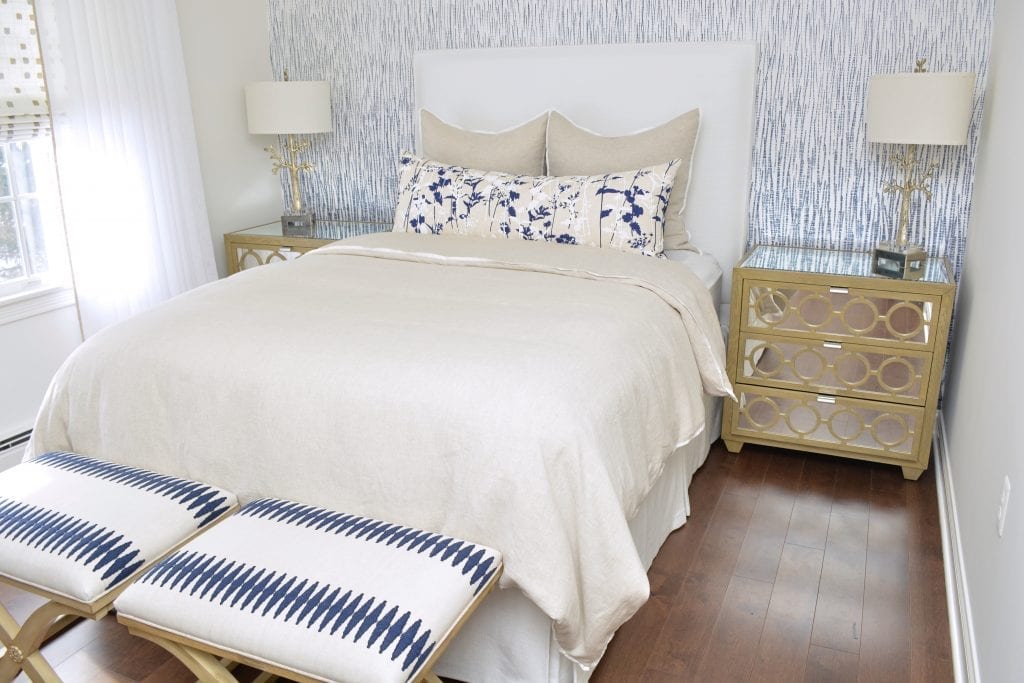
Guest Bedroom Makeover
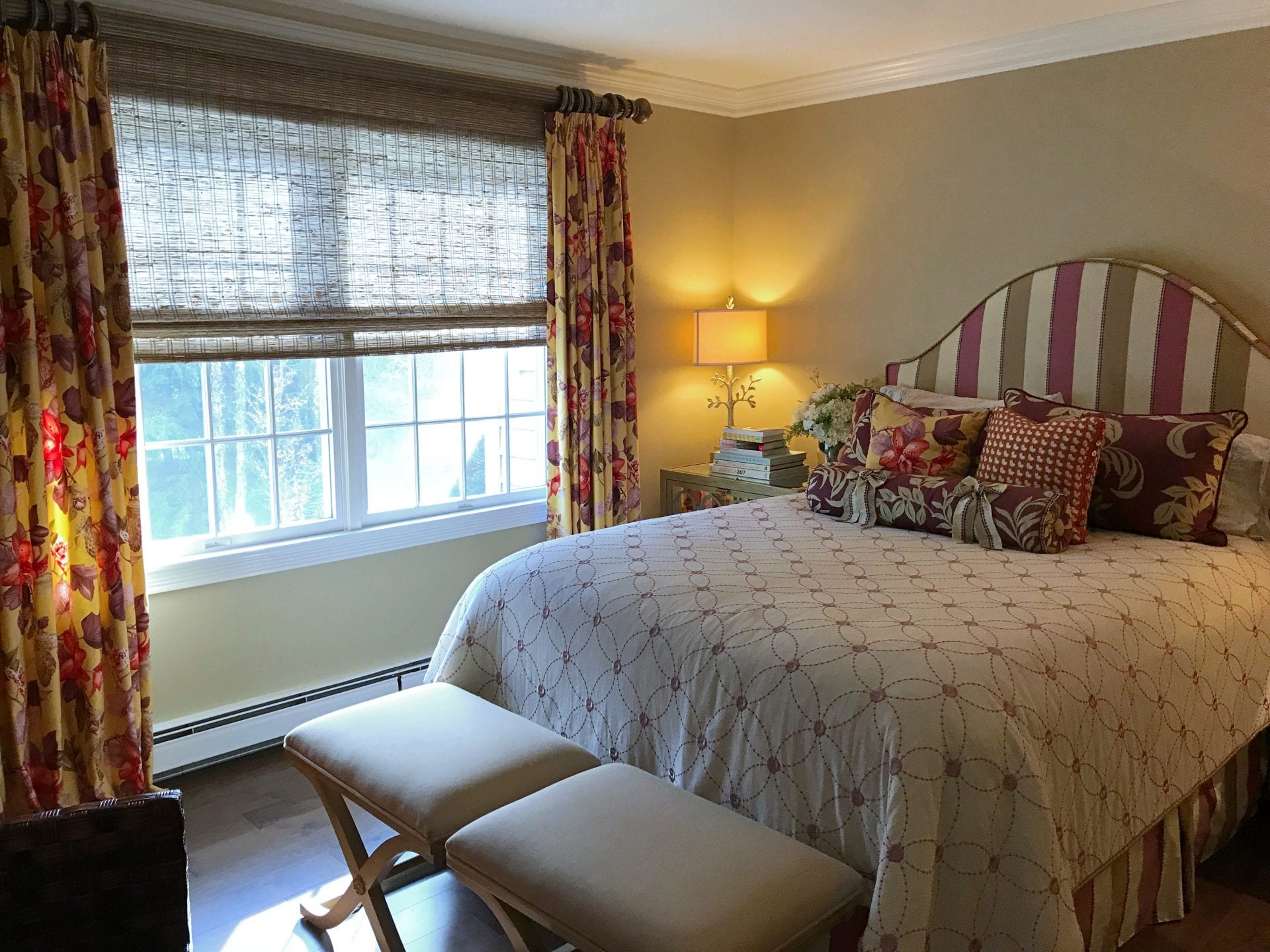
BEFORE
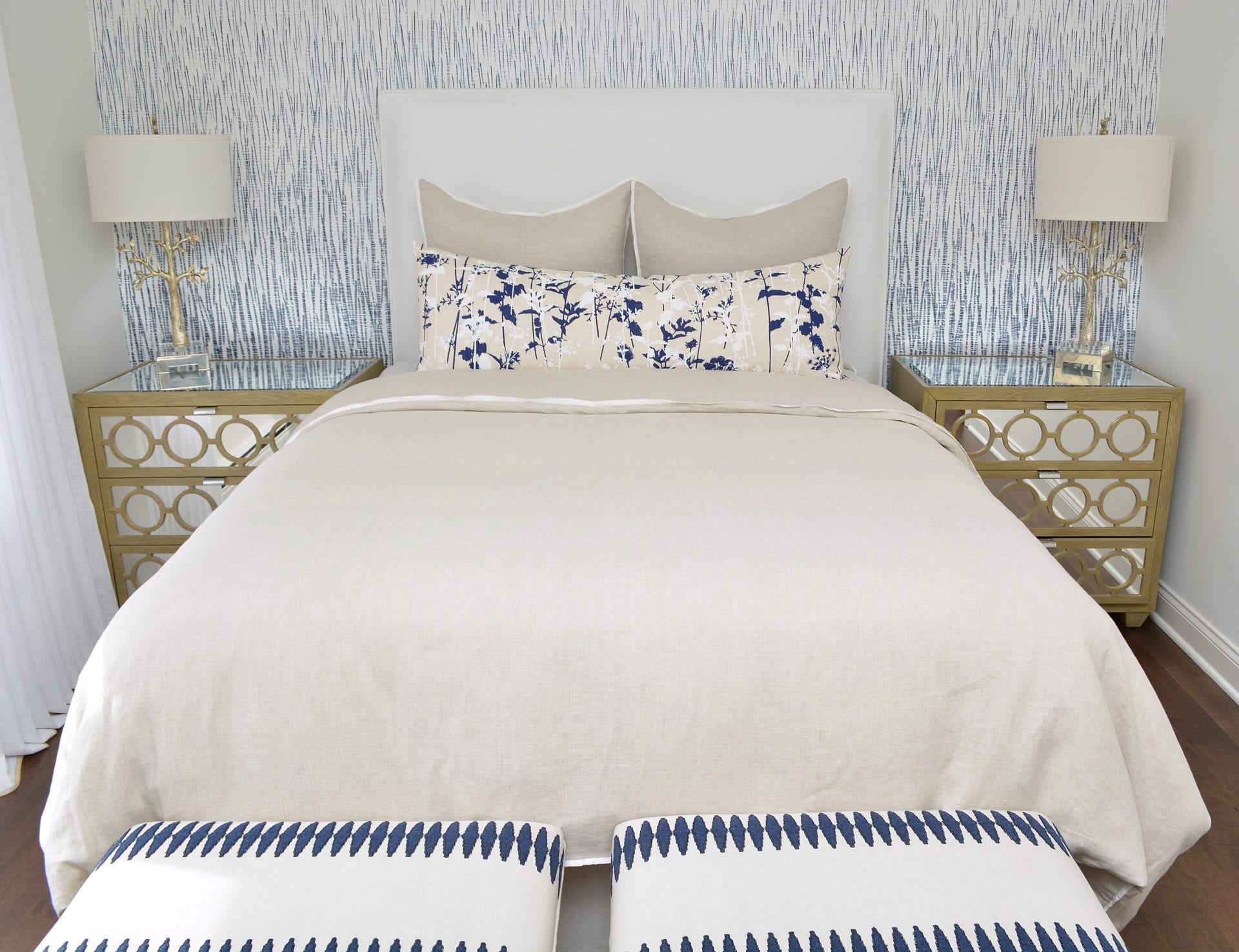
AFTER
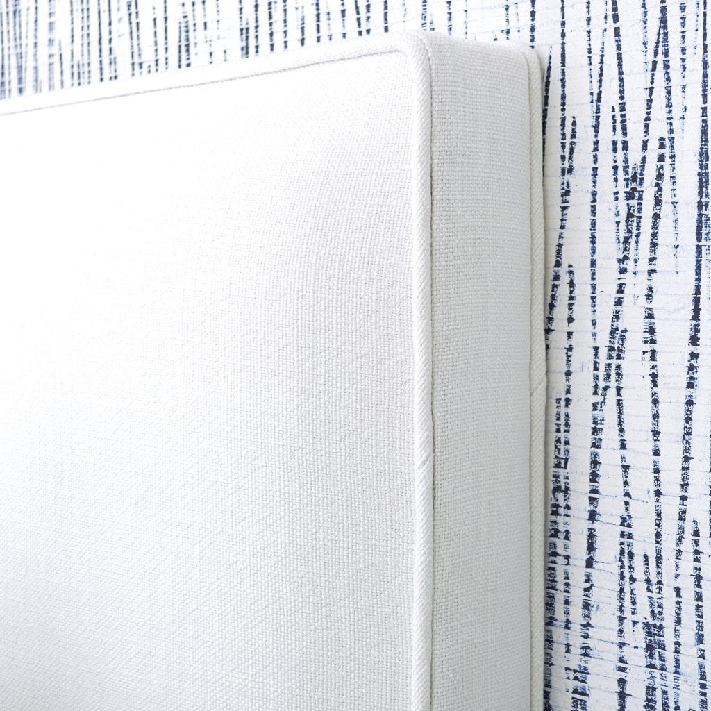
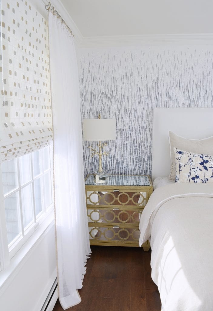
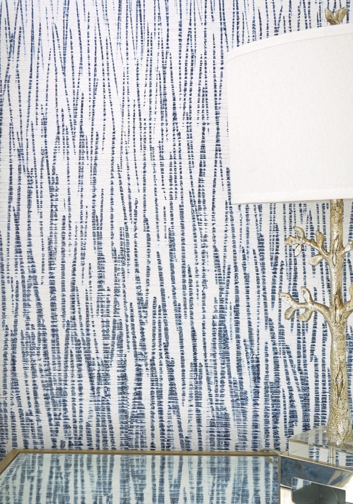
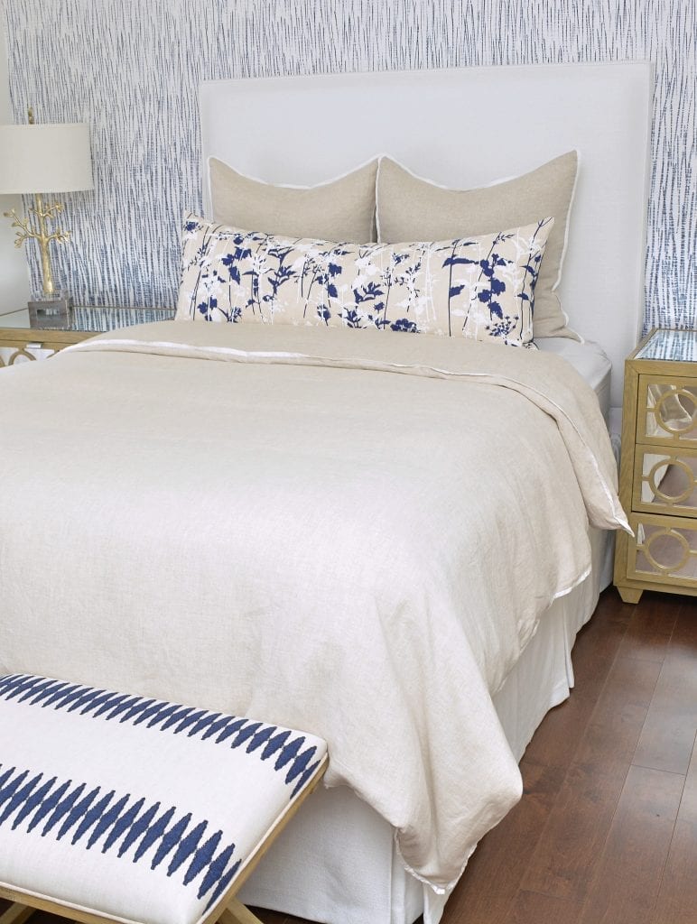
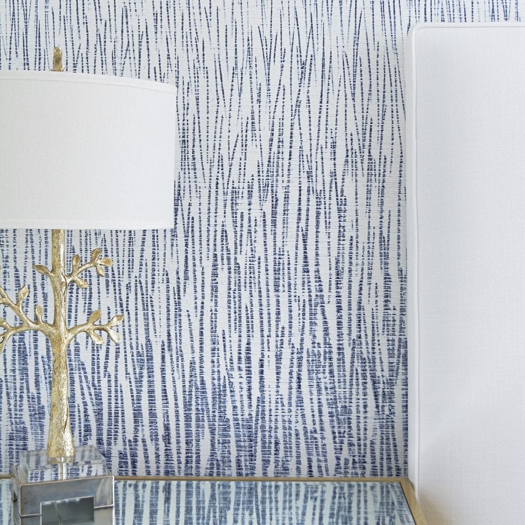
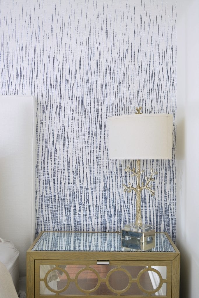
When were given the opportunity to work with a local client to update her guest bedroom, we happily took on the project! A beautiful 2-story colonial, with a view overlooking a private golf course. The goal was to change this room to feel like an oasis and a breath of fresh air. Previously full of saturated colors, curved lines and bold stripes, we switched to airy fabrics, straight lines and fun patterns. We started off with our Jute Wallpaper in Azure, which gave us the color palette of white and blue, and we based our design from that. This was easily one of our favorite moments in the space. We wanted to keep the original night stands and lamps, which were easily incorporated into our design.
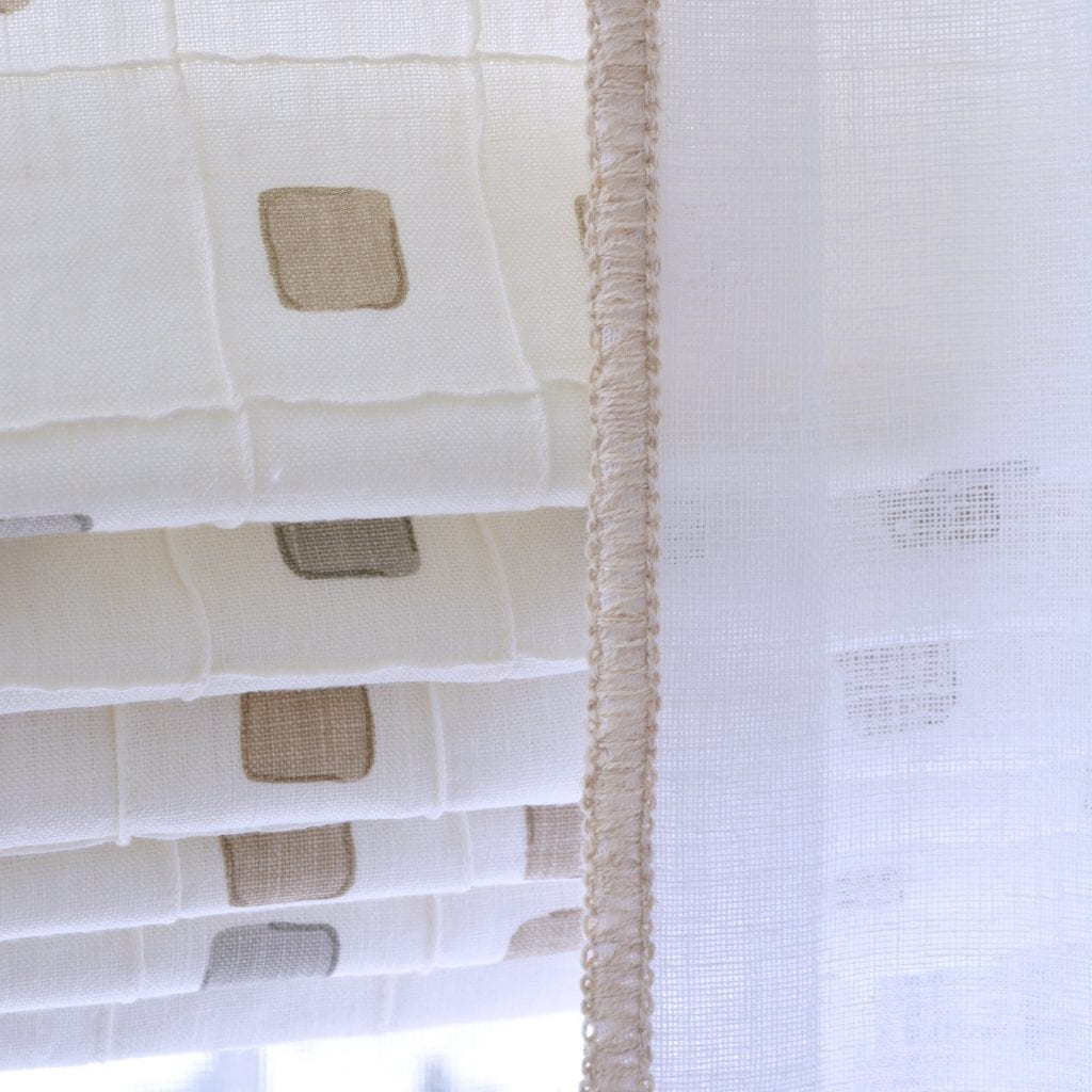
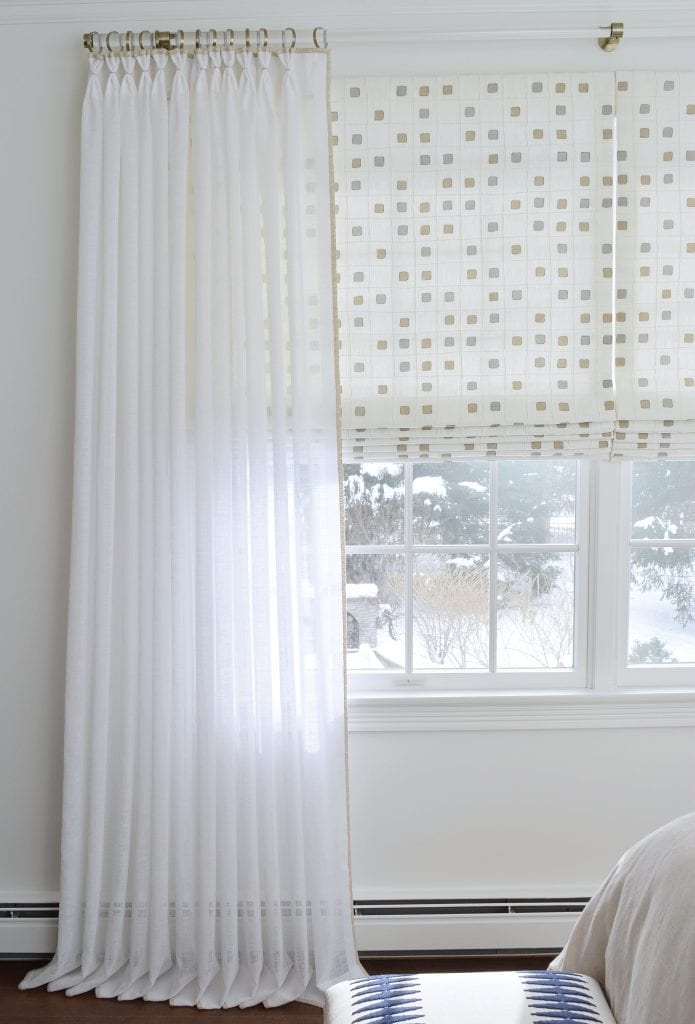
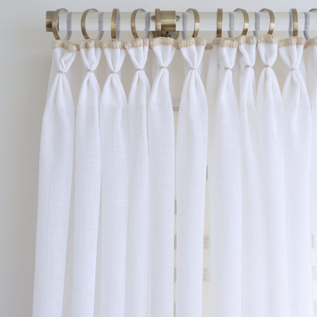
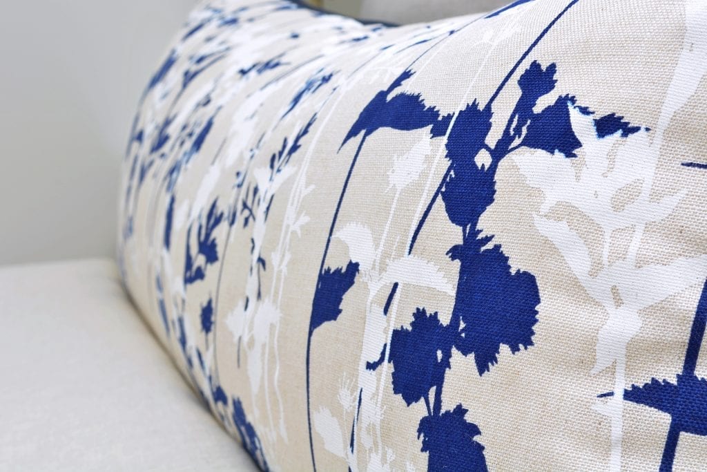
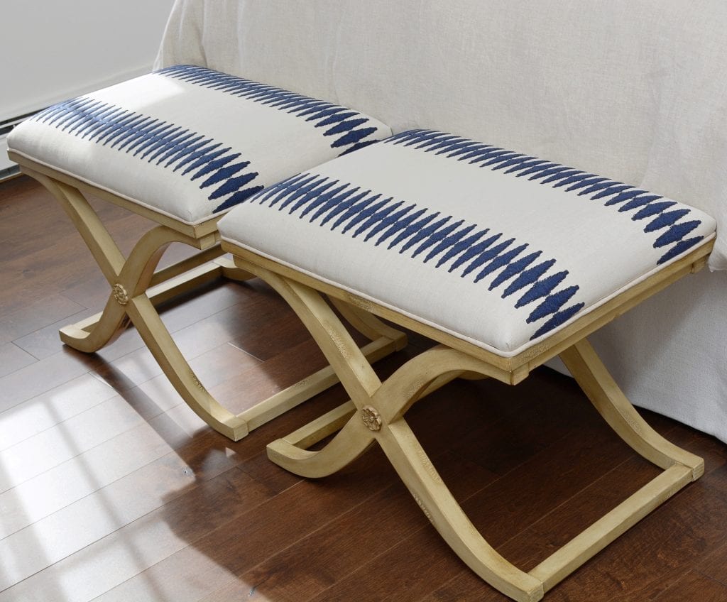
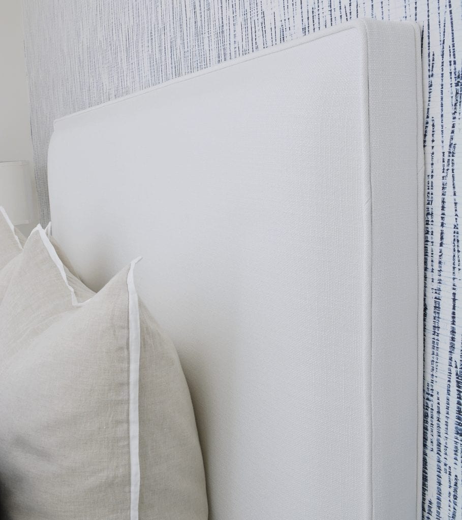
From the wallpaper came our Fremont lumbar pillow and Sheer Whipstitch Drapes. The room was slowly starting to come together and everything else was falling into place. Lattice roman shades, acrylic hardware and headboard were the final pieces. The roman shades had a good focal print, so we used drapes with minimal detail. Our client had requested to have her benches re-upholstered, which was the perfect idea. We applied a linen fabric featuring a raised wool pattern, for a gorgeous detail and pop of color. Paint color that we chose has been our go-to lately, Benjamin Moore White Dove OC-17 has been working beautifully for us and our products. The original dark floors were a prefect balance between the whites and mostly muted tones.
This project was a dream, and it was amazing to see our products come together so beautifully!
Tip: When working on any design, from an entire house to one bedroom, or updating window treatments, it’s always nice to lay everything out in front of you in the room you are working on. Always try to have samples of the fabric, paint, furniture finish, wallpaper etc, to get a good visual of the finished product before it even begins. This will allow you to see if colors, textures and patterns will work well with each other.

